New Trailhead Badge: Accessible Salesforce Customizations
Salesforce just released a new accessibility-focused badge on Trailhead, and it’s one of the more practical ones we’ve seen in a while. Instead of staying theoretical, this module walks through the kinds of real configuration choices admins make every day and shows how those decisions affect usability for actual humans. Page layouts, tabs, headings, screen flows, error messages. The small details that quietly determine whether someone can move through an org easily or gets stuck before they even reach the information they need.

This badge positions accessibility as a core part of good Salesforce design, which is where it belongs. When layouts are structured clearly, labels are meaningful, and flows are organized logically, the experience improves for everyone, not just users relying on assistive technology. Below is a breakdown of each stage of the badge and what it covers, starting with the fundamentals before moving into hands-on fixes inside a Salesforce org.
Explore Digital Accessibility: Business Value and Technical Basics
This unit lays the groundwork by defining digital accessibility as removing the barriers that keep people from successfully using a page, form, or tool. It frames accessibility as a core part of Salesforce design, not an afterthought. When you build with accessibility in mind, you create cleaner experiences for everyone and avoid unintentionally blocking users who rely on assistive technology.
Created with the Blind Institute of Technology, the examples reflect real-world Salesforce use. The unit also makes the business case: accessible design expands who can use your product and often improves usability for all. It closes with technical basics, explaining how assistive tech relies on structure, labels, and semantics to interpret a page, and why thoughtful design is so important.
Key highlights in this module:
-
Everything must be reachable by keyboard, with no “focus traps”: Every interactive element should be accessible using only a keyboard, and users should never get stuck in a component they can’t exit.

-
Users need a clear visual indicator of where they are when tabbing: When navigating with the Tab key, the currently selected field or button must be visibly highlighted so users know their position on the page.
-
Headings and semantic structure are not optional, they’re navigation tools: Proper heading levels and semantic markup create a logical outline that screen readers rely on to move efficiently through content.
-
Color contrast has real thresholds, not vibes: Text and visual elements must meet specific contrast ratios to remain readable against their background (more on this here).
-
Images need meaningful alt text, or they’re functionally missing information: Alternative text should clearly communicate the purpose or meaning of an image so screen reader users receive the same information as sighted users.
It wraps with a practical skill: using browser developer tools to inspect the accessibility tree so you can see what a screen reader “sees,” not just what the page looks like. See the module here.
Restructure Page Layouts
This unit is where the badge gets hands-on inside Salesforce and it starts with a challenge: try doing the work without your mouse. The point is simple. If you’re used to clicking your way through an org, you can miss how painful a cluttered layout becomes for keyboard-only users.
The goal here is structural. Before you tweak wording or visuals, you fix the layout decisions that make users work too hard just to reach the main content. The badge frames “noise” as the enemy. Too many elements before the important part of the page means keyboard and screen reader users have to slog through everything to reach what they need.
In the provided Developer Edition org, the contact record page is intentionally built with common mistakes, so you can see the impact. The big problem is tab order. With the wrong template, the sidebar content appears before the main content in the navigation path. That means a user can be forced to tab through a pile of less-important items before they can even get to the Details tab.
You make a few structural improvements:
-
Switch to a page template that places the sidebar after the main content, so keyboard users hit the important stuff sooner
-
Reorder tabs so Details comes first instead of Related
-
Create a separate Marketing tab to keep specialized info out of the primary view
The lesson is that accessibility is often just smart information design. When the page is structured logically, it’s faster, calmer, and more predictable for every user, not just those using assistive tech. See the module here.
Optimize Navigation with Proper Headings in Page Layouts
This unit is all about headings as navigation infrastructure. It explains something a lot of admins miss: making text look like a heading doesn’t make it a heading. Screen readers don’t care about your font size. They care about whether the content is tagged as a heading in the underlying structure.
The unit uses a simple analogy: headings are like road signs. They help users understand where they are, what sections exist, and how to jump to the right place without crawling through every element on the page.
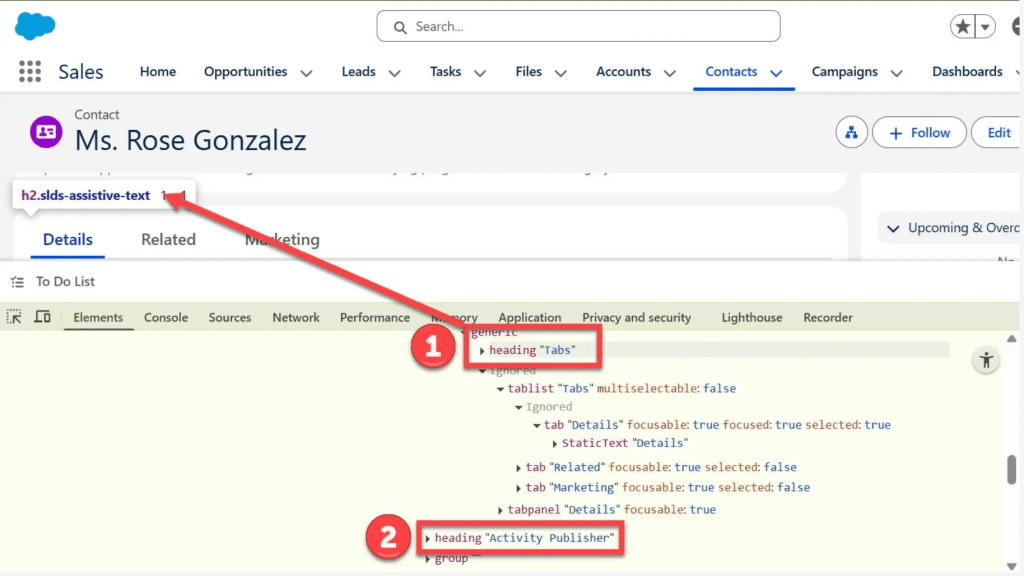
Salesforce already generates a lot of heading structure for standard components, but customization can break the chain. The example shows a rich text “heading” that looks obvious visually, but gets skipped by a screen reader because it’s not actually tagged as a heading.
So you fix the heading level properly. It also walks through a nuance that’s easy to overlook: Salesforce pages already include top-level headings by default, so your custom content should start at the appropriate level below that. In other words, you don’t just slap “Heading 1” on everything.
Then it goes further. Even if the page has headings, the content inside the Details tab can still be a nightmare if it’s just a long, flat list of fields. Without section headings, screen reader users can’t skim. They have to tab through everything.
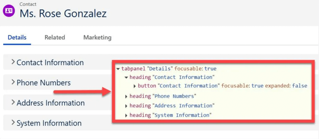
That’s where Dynamic Forms comes in. You upgrade the record detail component, create meaningful field sections, and reorganize fields into groups that match how humans look for information. You also move marketing-specific fields to the Marketing tab you created earlier, so the core Details view stays clean.
End result: the accessibility tree now has real, usable headings inside the Details tab, which makes the page dramatically easier to scan with assistive tech. See the module here.
Enhance Screen Flow Structure and Usability
This unit takes the same ideas and applies them to Flow. The theme is consistent: if there’s no structure, users get lost, and screen readers can effectively miss content entirely.
The badge uses an embedded “Report an Accessibility Issue” screen flow on the Service Home page. The issue is sneaky. If someone navigates that page by headings, the flow is basically invisible because it doesn’t generate a heading in the page structure. So the user won’t even know it’s there unless they tab into it manually.
First fix: make the flow discoverable by adding a header to the screen, which functions like a heading when embedded on a Lightning page. Once you do that, the flow shows up in heading navigation and becomes findable.
Then you clean up the screen itself. The unit calls out a classic form design mistake: relying on placeholder text instead of proper labels. That might look fine visually, but it breaks clarity and can be unreliable for assistive tech. It also highlights a misleading “fake label” situation where someone uses display text to look like a label but never actually connects it to the field in the code.
So you update the labels correctly, add a short intro that explains what the flow is for, and group the technical environment fields into a clearly labeled section. You also replace placeholder-like default text with real help text, so users don’t accidentally submit the placeholder content as their answer.
This is accessibility and usability in one move. Once the form has headings, real labels, clear sections, and instructions, it becomes easier for everyone to complete confidently. See the module here.
Fix Inaccessible Language and Visual Indicators
This unit shifts from structure to content. The message is simple: even if your layout is perfect, your wording and visuals can still create barriers.
First, it makes the case for plain language. Overly complex, academic, or jargon-heavy text forces users to work harder than necessary, especially users with cognitive disabilities, users reading in a second language, or anyone trying to move quickly through a task. The unit pushes a practical target: write in a way that a typical middle school reading level can understand without effort.
Then it tackles visual indicators. The example uses a star-rating formula field that shows different images based on Lead Source. The visuals are helpful for sighted users, but the alt text is useless because every version announces the same generic word. That means a screen reader user hears identical output no matter what rating appears.
The fix is to make the alt text carry the meaning, not just the fact that an image exists. Instead of one generic label, each star image gets a matching alt label that communicates the actual rating. Accessible design isn’t “add alt text.” It’s “make alt text meaningful.” See the module here.
Improve Clarity in Error Messages and Hyperlinks
The final unit tackles two small details that create major frustration when teams handle them poorly: errors and links.
First up: error messages. The unit points out that a vague “Error” doesn’t help anyone. If users don’t know what they did wrong, they can’t fix it. That leads to wasted time, abandoned tasks, and sometimes messy data.
In the flow, a validation rule blocks special characters in a field. When a user enters something like “Windows?” they get a generic error that doesn’t explain the rule. So you rewrite the message to be direct and actionable: what went wrong and what to do next.
Then it covers link text. Screen reader users often pull up a list of links on a page out of context. If every link says “Click here,” that list is useless. The fix is to make link text stand on its own by describing the destination or action.
In the confirmation screen, you replace vague linked text with a descriptive link. This clearly indicates it will open the case that was created, and you also increase font size to improve readability.
It closes with a bigger principle: don’t treat accessibility as something to fix at the end. Build it in from the start. When accessibility is part of planning and design from day one, it becomes a standard requirement. See the module here.
Final Thoughts
This new Trailhead badge makes accessibility feel less like a theory lesson and more like a set of everyday admin decisions. Small structural changes to layouts, headings, flows, and messaging can dramatically improve how people move through an org. The biggest takeaway: accessibility is not a final polish step. It’s part of building a Salesforce environment that actually works for the people using it. With good structure, clarity, and navigation from the beginning, you end up with more usable experiences across the board.
Explore related content:
Unleashing the Power of Editable Data Tables in Salesforce Screen Flows
What Nonprofits Taught Me About Building Salesforce for Humans, Not Just Systems
The New Slackbot Is Here: What Salesforce Just Shipped, Why It Matters, and How Teams Should Use It
