What Nonprofits Taught Me About Building Salesforce for Humans, Not Just Systems
User adoption lessons from five years of nonprofit implementations

Three years into my Salesforce career, I sat across from a development director at a mid-sized nonprofit. She had tears in her eyes.

Not because the implementation failed. Because it worked exactly as designed.
The problem was that “as designed” meant she needed 47 clicks to log a major gift. I had built a technically sound solution. Validation rules caught bad data. Flows triggered the right follow-ups. Reports pulled accurate numbers. By every Salesforce best practice I knew, this was a successful implementation.
She used a spreadsheet instead.
That conversation changed how I build Salesforce. Not the technical skills, but the philosophy underneath them. After five years of working primarily with nonprofits and healthcare organizations, I’ve learned more about user adoption from people who “just need it to work” than from any certification exam.
Here’s what they taught me.

The Nonprofit Reality Check
Most Salesforce content assumes your users are full-time admins. Or at least tech-comfortable professionals who chose to work with the platform.
Nonprofit staff are neither.
Your typical nonprofit Salesforce user is a program coordinator who also handles donor communications, event logistics, volunteer scheduling, and board meeting prep. Salesforce is maybe 15% of their job. They learned it during a two-hour training six months ago. They have questions but feel embarrassed to ask because “everyone else seems to get it.”
This isn’t a skills problem. It’s a context problem.
When I started consulting, I built Salesforce the way I learned it: comprehensive data models, validation rules for every edge case, automation for anything that could be automated. I was proud of these implementations. Technically elegant.
They also had 30% adoption rates.
The shift happened when I stopped asking “what’s the right way to build this?” and started asking “who’s actually going to use this, and what’s their Tuesday afternoon like?”
Fewer Clicks Beats Perfect Architecture
There’s a concept in Salesforce circles about building for scale. Design your data model to handle growth. Create relationships that support future reporting needs. Plan for the organization you’ll become, not the one you are.
For enterprise clients with dedicated Salesforce teams, this makes sense. For a nonprofit with a rotating cast of AmeriCorps members managing their database, it’s a recipe for abandonment.

I now design with a different question: what’s the minimum number of clicks to complete the most common task?
For a development team logging donations, that means putting the “New Donation” button on the Contact page, not buried in the Opportunities tab. It means auto-populating everything that can be auto-populated. It means accepting that some fields will stay blank because asking for “preferred communication method” on every gift entry adds friction that reduces data quality overall. Sectioned layouts reduce cognitive load compared to field-dense pages.
The technically pure solution isn’t the right solution if nobody uses it.
One nonprofit I worked with had a previous consultant build an elaborate program tracking system. Multiple custom objects, junction tables, roll-up summaries. Architecturally correct.
The staff had created a workaround using Tasks and a shared Google Doc.
We rebuilt it with one custom object and ten fields. Adoption went from 20% to 85% in a month.
Design for Turnover, Not Tenure
Nonprofit staff turnover runs high. Really high. This means the person you train on Monday might be gone by December, and their replacement will learn Salesforce by clicking around and guessing.
Every implementation decision needs to pass what I call the “new hire test”: can someone figure this out without calling you?
This changes everything.
Field Names
“Stage” means nothing to someone new. “Donation Status” does. I use plain language labels even when the API name follows conventions.
Help Text
Every custom field gets help text. Not “enter the value here” help text, but actual guidance. Something like: “Enter the date you first contacted this donor about this specific gift. If this is a recurring gift, use the original ask date.”
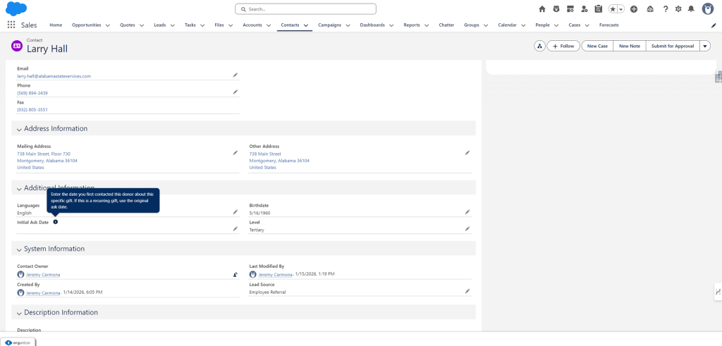
Page Layouts
Group fields by workflow, not by data type. Put the fields someone fills in during intake together. Put the fields someone updates after a meeting in another section. Match the screen to the job, not the object model.
Record Types
Fewer is better. Every record type is a decision point. Decision points slow people down.
I once audited an org with 11 record types on the Contact object.
Eleven.
The staff had been randomly selecting them for years. The data was meaningless. We consolidated to three record types: Individual Donor, Organization Contact, and Volunteer. Data quality improved immediately because people could actually make the choice.
Automation Should Be Invisible
Flows and automation are powerful. They’re also confusing for users who don’t know they exist.
I’ve watched teams manually update fields that automation already controls, creating conflicts in the data. Sometimes records change “on their own,” and no one knows why. In other cases, users invent workarounds because they assume the system can’t do something it’s already doing.
The principle I follow now: if a user needs to know about an automation to do their job, the automation is designed wrong.
Good automation happens in the background. The thank-you email sends. The task creates. The field updates. The user doesn’t think about it because they don’t have to.
When automation does need to be visible, I make it obvious. Screen flows with clear instructions. Alert messages that explain what happened. Not tooltips or documentation, but in-the-moment guidance.
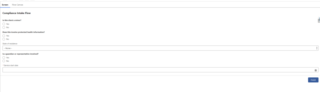
A healthcare nonprofit I worked with had complex compliance requirements. Previous implementation: a 20-field form with validation rules that blocked saves when requirements weren’t met. Staff hated it.
The new approach: a screen flow that asked five questions, then auto-populated the 20 fields based on answers. Same compliance. Zero frustration.
Listen to the Complaints
The best implementation feedback doesn’t come from user acceptance testing. It comes from overheard complaints.
“I hate how I have to…” is the start of a process improvement. “This is so stupid…” is a design flaw you missed. “I just skip that part…” is a feature you built that nobody wanted.
I tell every client to forward me their complaints. Not polished feedback from quarterly reviews. The raw, frustrated emails. The Slack messages. The muttered comments in meetings.
Nonprofits are especially good at this because they’re too busy to be diplomatic. They’ll tell you directly when something doesn’t work. This is valuable.
One of my best implementations came from a complaint that users “had to click too many things to get to donations.” Turned out they were going Home → App Launcher → Donations → List View → Contact Name → Related Donations. Seven clicks minimum.
We added a custom search component to their Home page. Type a name, see their donations. Two clicks.
That’s it. Not technically impressive. Massively useful.
Beyond Nonprofits
These principles aren’t nonprofit-specific. They work anywhere users have competing priorities, variable technical comfort, or limited time for training. Enterprise implementations fail for the same reasons nonprofit ones do. Too much complexity. Not enough empathy. Solutions designed for architects instead of end users.
The questions I ask on every project now:
- Who is the most reluctant user, and what would make them actually use this?
- What’s the most common task, and what’s the minimum friction path to complete it?
- If I left tomorrow and someone new had to figure this out, could they?
- What complaints am I going to hear in three months, and can I prevent them now?
These aren’t technical questions, and that’s the whole point.
The Human-First Philosophy
Salesforce is a tool. Tools exist to make work easier. When the tool makes work harder, people find other tools.
My development director with the 47-click donation process wasn’t wrong to use a spreadsheet. She was responding rationally to a system that ignored her reality. The system failed her. She didn’t fail the system.
When I taught Salesforce Administration at NYU, my students learned the technical skills: flows, validation rules, reports, security models, but the lecture I give most often is about empathy. About sitting with users and watching them work. About asking questions that have nothing to do with Salesforce.
Because the best implementations aren’t the ones with the cleanest architecture. They’re the ones people actually use. Nonprofits taught me that. And every implementation I’ve done since has been better for it.
Explore related content:
Salesforce Platform Admin Certification: Navigating the 2025 Changes
How To Build Inline Editing for Screen Flow Data Tables in Salesforce
Salesforce Launches Free CRM: How It Stacks Up Against HubSpot and Zoho in 2025