Summer ’26: What the New Accessibility Release Updates Mean for Your Org
Accessibility has long been on Salesforce’s roadmap, but Summer ’26 marks the beginning of something more structured: a rolling set of release updates specifically targeting WCAG 2.2 Resize and Reflow compliance. If you support users who rely on browser zoom, work with assistive technology, or simply use a high-DPI display at elevated magnification, these updates matter. Here’s what’s changing, when it lands, and what you need to do.

Two updates are enforced in Summer ’26, with two more following in Spring ’27 and Winter ’27. The order you enable them matters (some have hard dependencies on others) and skipping straight to enforcement without testing in a sandbox is a risk you don’t need to take. This post walks through all four updates, what each one fixes, and exactly where to go in your pre-release org to capture screenshots and validate behavior before your production instance upgrades.
What Is WCAG 2.2 and Why Salesforce is Updating Lightning Experience
The Web Content Accessibility Guidelines (WCAG) 2.2 include specific success criteria around Resize Text and Reflow, which require that web content remain usable when users zoom in to 200% or beyond, without loss of content or functionality and without requiring horizontal scrolling. For years, Salesforce’s Lightning Experience UI had gaps here. At high magnification, page headers would stay fixed and obscure content as users scrolled. Modal windows would push buttons and form controls off-screen. UI components would clip rather than wrap. For users with low vision who depend on significant magnification to work, these weren’t minor annoyances. They made parts of Salesforce genuinely unusable.
Salesforce is now addressing this systematically, rolling out fixes component category by component category across multiple releases. Summer ’26 kicks off the sequence with two enforced updates, and two more are queued for Spring ’27 and Winter ’27 respectively.
Page Headers and Modal Windows (Enforced Summer ’26)
This is the foundational update. Everything else in this rollout depends on it, so it goes first.
Before this change, zooming past 200% in Lightning Experience created issues. Sticky page headers remained fixed at the top of the viewport while the rest of the page scrolled, meaning they sat on top of content the user was trying to read. In modal dialogs, action buttons and content areas could extend beyond the visible viewport, requiring horizontal scrolling to reach them. In practice, this made many modals non-functional at high zoom.

With this update enabled, the page header scrolls with the page instead of overlapping it. Modal windows resize and reflow so that buttons and content stay within the viewport. Salesforce says these changes support users zooming to 300% or even 400%, which is a meaningful accessibility improvement for users with significant visual impairments.

This update is enforced in Summer ’26, meaning Salesforce will activate it automatically in your org on your instance’s major release date. You can get that date from the Trust Status page at status.salesforce.com by searching for your instance and checking the Maintenance tab.
To test it before enforcement, go to Setup, search for Release Updates in Quick Find, and find “Enable Accessibility Enhancements for Page Headers and Modal Windows When Zoom Is Greater Than 200%.” Walk through the activation steps from there.
Date Pickers, Popovers, Bottom Utility Bars, and Record Headers (Enforced Summer ’26)
This update is a direct continuation of Update 1. You must enable the page header and modal window update first before activating this one.
The components addressed here are all common in day-to-day Salesforce usage. Date picker fields appear throughout records and reports. Popovers surface inline detail without navigating away. Bottom utility bars give quick access to open items. Record headers carry the key fields users reference constantly. Prior to this update, all of these could display partially or clip content at high zoom levels, falling short of WCAG 2.2 compliance.
After this update, date pickers, popovers, and page headers are usable at 1280px page width with 400% magnification. Bottom utility bars handle overflow by truncating button labels rather than pushing content out of the bar. Truncated labels appear in a tooltip on hover or keyboard focus, so users can still identify what each button does.
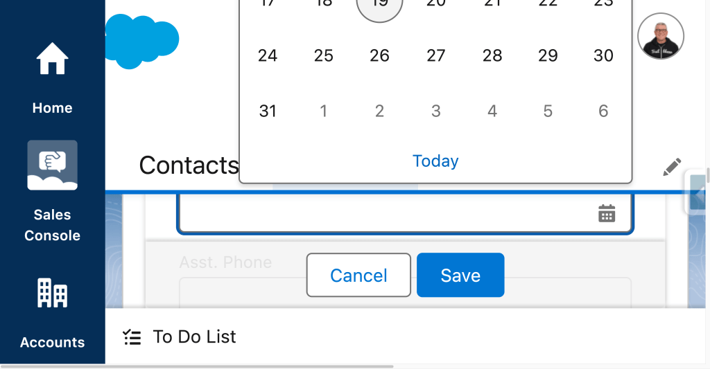
To Do Lists and Lightning Dual Listboxes (Enforced Spring ’27)
This one doesn’t land until Spring ’27, but it’s worth knowing about now. since it’s part of the same rollout arc and you may want to test it in pre-release environments as it becomes available. Unlike Updates 2 and 4, this update does not have a stated dependency on the prior updates, so it can be enabled independently.
To Do lists and Lightning dual listboxes are both common in productivity-focused Salesforce setups. Dual listboxes in particular appear in custom components, flow screens, and permission set assignments. At high zoom, content in both of these UI elements could display only partially or clip rather than wrapping to the next line.
After this update, content wraps instead of clips. To Do list items are accessible and usable at 1366px page width and 400% magnification. The Spring ’27 enforcement window gives admins additional lead time to test, but if your org has users who rely on high magnification, it’s worth getting ahead of this one rather than waiting for automatic enforcement.
Cards, Docked Containers, Menu Lists, and Panels (Enforced Winter ’27)
This update is part of the same dependency chain as Updates 1 and 2. Enable the page header and modal window update first. Then, enable the date pickers and popovers update before activating this one. It targets four more component types: cards (which appear throughout Lightning pages and dashboards), docked containers (like the docked composer for emails and calls), menu lists (dropdown and action menus throughout the UI), and panels (detail panels, help panels, and side panels).
At high zoom without this update, header content in these elements can clip rather than reflow. After enabling it, headers wrap to accommodate the available viewport width. Cards, docked containers, menu lists, and panels all become accessible and usable at 1280px page width with 400% magnification.
Start Testing Before Salesforce Forces Your Hand
Salesforce has been explicit that this is the beginning of an ongoing effort, not a one-time fix. The release notes indicate that more UI elements will receive similar treatment in future release updates as Salesforce works toward broader WCAG 2.2 compliance. The rollout is sequenced deliberately, starting with the foundational components that others depend on and expanding outward.
For admins, the action items are straightforward. Enable the accessibility updates in order and don’t skip steps: Update 1 (page headers and modals) must come first. Update 2 (date pickers, popovers, utility bars, record headers) requires Update 1. Update 4 (cards, docked containers, menu lists, panels) requires both Update 1 and Update 2. Update 3 (To Do lists and dual listboxes) is independent and enforced in Spring ’27. Test each in your pre-release or sandbox environment before enforcement. If your org has accessibility requirements or accommodates users who rely on zoom, test proactively.
The accessibility improvements themselves are significant. Supporting users at 300% to 400% magnification isn’t a niche requirement. For users with low vision who depend on meaningful magnification to do their jobs in Salesforce, these updates are practical improvements to how the platform works for them.
Explore related content:
Get Your Org Ready: Summer ’26 Admin Highlights
Warn and Inform with Native Toast Messages in Salesforce Flow
