Choices, Choices: What Are Radio Button Groups Best Used For
Summer '26 Screen Flows: A Complete Guide to Choice Components

Salesforce’s Summer ’26 release is packing some serious automation upgrades. Whether you are managing multi-stakeholder approvals, scaling orchestration across your org, or building complex integrations without code, the platform is steadily removing friction points for admins. Among the most anticipated and highly visible improvements are the user interface enhancements coming to Screen Flows.
If you have ever built a screen flow and felt like you just couldn’t find the exact picker component you really needed, you are not alone. For years, Salesforce admins have relied on a standard set of inputs, but sometimes those options don’t quite fit the modern, streamlined aesthetic required for consumer-facing or high-efficiency internal apps. With the Salesforce Summer ’26 release, we are finally getting a massive UI upgrade to solve this: the Radio Button Group component.
The Problem with Traditional Inputs
Historically, when admins wanted to present users with a single-select choice, they relied heavily on traditional radio buttons, checkboxes, or picklists. While highly functional, these standard inputs can take up significant screen real estate. In complex flows, vertically listed radio buttons or extraordinarily long picklists often force users to scroll excessively, leading to a clunky and outdated user experience.
The Solution: Compact, Responsive Radio Button Groups
The new Radio Button Group component solves this real estate problem by offering a more compact and easily scannable alternative. It retains the core functionality of traditional radio buttons, meaning users can still only select a single option at runtime, but it completely overhauls the visual layout.
Visually, these actually look like “proper buttons” rather than old-school radio circles, giving your users a completely different interface experience than what we previously had inside Flow Builder. This component is fully responsive and adapts intelligently to the user’s device:

On Desktop: Choices are presented as horizontally stacked options, making excellent use of wider screens and drastically reducing vertical scrolling.
On Mobile: Choices automatically shift to a vertically stacked layout to accommodate narrower touch screens
Example Use Cases and Pro-Tips
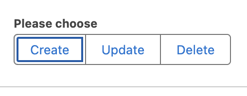
Because these look like actual buttons, they are perfect for making quick, high-level decisions obvious to the user.
Action Selection: Give your users a clear, button-driven choice to “Create,” “Update,” or “Delete” a record
Shipping & Checkout: Instead of burying delivery speeds in a dropdown, present horizontal, button-like choices for “Standard,” “Express,” and “Overnight” shipping.
Adding this to your flows is incredibly simple. Inside Flow Builder, you just drag the Radio Button Group component from the left panel directly onto your screen, and configure it by adding your desired choices.
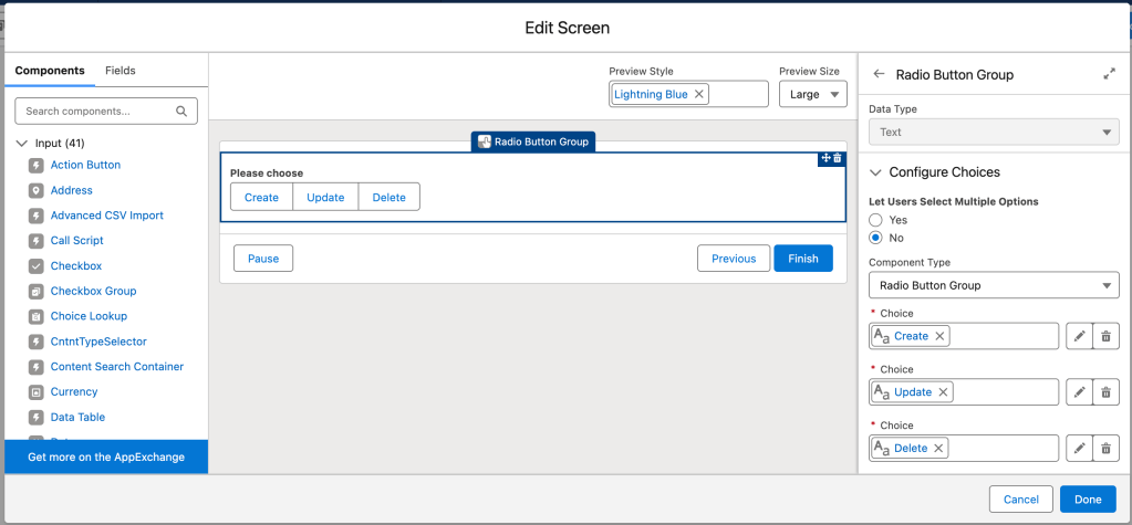
A Pro-Tip on Customization (Icons vs. Emojis): If you are looking to make these buttons even more visual, there is one important design limitation to keep in mind. If you select a standard Salesforce icon for your choice, it is not going to display inside the Radio Button Group.
If you absolutely need native Salesforce icons, you will still want to use the Visual Picker component. However, there is a fun and easy workaround: you can use emojis directly in your choice text labels. Many Trailblazers have already started using emojis while demoing this new functionality to add a pop of color and visual context to these new button groups.
A Comprehensive Review of Choice Components in Salesforce Flows
While the new Radio Button Group is exciting, Salesforce Flows offer a wide variety of choice components, each suited for specific scenarios. Here is a short review of all the choice components currently available to help you build the best user experience.
Standard Radio Buttons
What it is: The classic vertical list of circular clickable options.
When to use it: Use this when you have a small number of mutually exclusive choices (usually 2 to 5) and you want all options to be immediately visible to the user without requiring them to click a dropdown.
Drawbacks: As noted in the Summer ’26 updates, standard radio buttons stack vertically and can take up too much vertical screen space, causing excessive scrolling on longer forms
Picklists (Dropdowns)
What it is: A standard dropdown menu that reveals a list of choices when clicked.
When to use it: Picklists are ideal when you have a long list of mutually exclusive options (e.g., a list of 50 US States) and you need to conserve screen real estate.
Drawbacks: They require an extra click to view the options, which hides information from the user until they interact with the component.
Dependent Picklists
What it is: A set of picklists where the choices available in the second (dependent) picklist are dynamically filtered based on the value selected in the first (controlling) picklist.
When to use it: Perfect for hierarchical data, such as selecting a “Country” and then selecting a “State/Province” within that specific country.
Summer ’26 Update: As of Summer ’26, Dependent Picklists are one of the expanded components that now support styling overrides. You can customize their look and feel to override your org’s default theme, giving you more branding control.
Checkboxes (and Checkbox Groups)
What it is: Square selection boxes that allow for multiple selections.
When to use it: Use checkboxes when the user is allowed to select more than one option at a time (“Select all that apply”), or as a standalone boolean (True/False) toggle.
Drawbacks: Like standard radio buttons, long lists of checkboxes can clutter the screen and force scrolling.
Visual Picker
What it is: A highly visual, tile-based selection component that supports the inclusion of native Salesforce icons and rich text.
When to use it: Use the Visual Picker when you want to create a visually engaging, card-like selection experience. As mentioned previously, if you need to display standard Salesforce icons alongside your choices, the Visual Picker is the component you must use, as the new Radio Button Group does not support them.
Choice Lookup
What it is: A search-based input field that allows users to type and dynamically filter through a massive list of choices or records.
When to use it: Use this when your list of choices is too large for a standard picklist, and you want to provide a “search-as-you-type” experience to help the user find their desired option quickly.
Summer ’26 Update: Just like Dependent Picklists, the Choice Lookup component has been upgraded in the Summer ’26 release to support full styling overrides. You can now customize its style and layout to perfectly match your Experience Cloud site or custom Lightning app.
Ready to Build Better Screen Flows? Start With Summer ’26
With the addition of the new Radio Button Group component, admins now have more flexibility than ever to design intuitive, low-friction screen flows. By understanding the strengths and limitations of each choice component, from the visual flair of the Visual Picker to the space-saving utility of Picklists and the modern layout of the Radio Button Group, you can ensure your Salesforce automations look just as good as they function.
The best part? These are not just cosmetic upgrades. When users can scan choices faster, make decisions with fewer clicks, and navigate flows without excessive scrolling, you see real downstream impact: higher completion rates, fewer errors, and less admin rework. Whether you are building a customer-facing Experience Cloud app or an internal ops tool used by your sales team every day, thoughtful component selection is what separates a flow that users tolerate from one they actually enjoy. Take some time in a sandbox this release cycle to swap out those legacy radio button stacks and long picklists for their Summer ’26 counterparts. The difference will be immediately obvious.
Explore related content:
11 Flow Updates in Summer 26 Release
Summer ’26: What the New Accessibility Release Updates Mean for Your Org
Warn and Inform with Native Toast Messages in Salesforce Flow
Summer ’26: What the New Accessibility Release Updates Mean for Your Org
